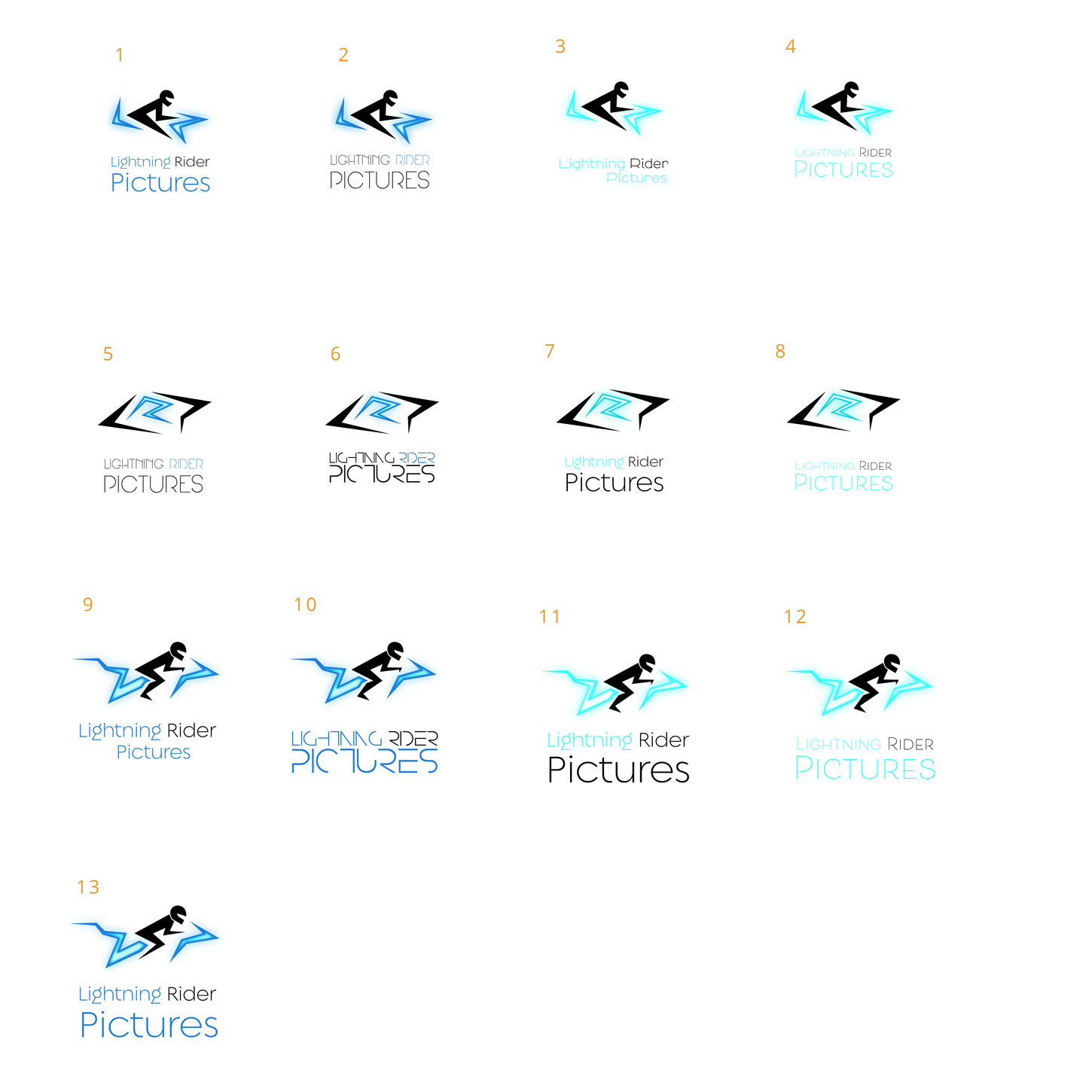
David Hayter contacted will for a brand identity after David made a guest appearance on Will's podcast. David wanted something iconoclastic, inclusive, and badass, that spoke to the highly creative products his company produced, while also giving a touch of 80s flare.
THE CHALLENGE
RESEARCH
75%
42%
60%
75% of people recognize a brand by its logo. 42% of consumers believe a logo effectively communicates a brand's personality. 60% of consumers will avoid a brand with a logo they find odd, ugly, or unappealing.
IDEATION
David wanted something iconoclastic, inclusive, and badass. He fell in love with the idea of the logo encompassing the director's viewfinder and of representing fast, forward movement.

CLIENT |
Lightning Rider Pictures
PROJECT |
Brand Identity
ROLE |
Visual Designer
DETAILS |
Brand Identity developed for David Hayter's (Executive producer behind Warrior Nun, Xmen, and more) production company, Lightning Rider Pictures.


PROTOTYPE
David wanted something iconoclastic, inclusive, and badass. He fell in love with the idea of the logo encompassing the director's viewfinder and of representing fast, forward movement.
TEST
David wanted something iconoclastic, inclusive, and badass. He fell in love with the idea of the logo encompassing the director's viewfinder and of representing fast, forward movement.


